I Read It So You Don’t Have To Dept.
The Information Inferno, by Whodini™
If it is hard for ‘kids today’ to appreciate what life was like before the advent of cell phones, it is almost as difficult even for those of us who lived through that strange sea change we now just call ‘the Internet’ to fathom the madness of minds great and small who saw the future coming and thought they were surfing a wave of exciting boundless technological change into a glorious Promised Land of scientific marvels and a wholly new era in the very lives of humans on this puny Earth. Even as we first read Mondo 2000 and Wired magazine, some of us must have realized that the vast transformational paradise described in their pages was, as we call it nowadays, ‘vaporware’, a beautiful pipe dream, but like many (if not most) results of hitting too hard the pipe, as evanescent and imaginary as any other hallucinatory fantasy. For all the transhumanist promises of R. U. Sirius of the soon-to-arrive wonders of smart drugs and the revolution of the totally connected world, we now can survey the ruins of the dream and see the decay of new evolutionary cultural spaces of self-publishing and ‘Information Must Be Free’ into ad-supported podcasts controlled by huge behemoths who managed to carve out their own territory just as the railroads managed to make off with most of the (admittedly stolen) lands opened up to settlers throughout the West in 19th Century America. Instead of transfigurational connectivity we have Dark Mode; rather than the (usually dystopian, but still always ‘cool’) weirdly wired world of Neruromancer and Johnny Mnemonic, we have 5G service that still seems to take forever loading the new Kingdom Rush or Township or Candy Crush or Pokemon GO updates; in lieu of acetylcholine-infused cocktails regenerating and improving brain cells, we have battery life issues solved by bigger phones and portable or wireless chargers and still not enough power; instead of a new Golden Age or at least a pleasure world for the hacker elite, we have a new set of millionaires (now called billionaires) who rule because of … well, that’s debatable.
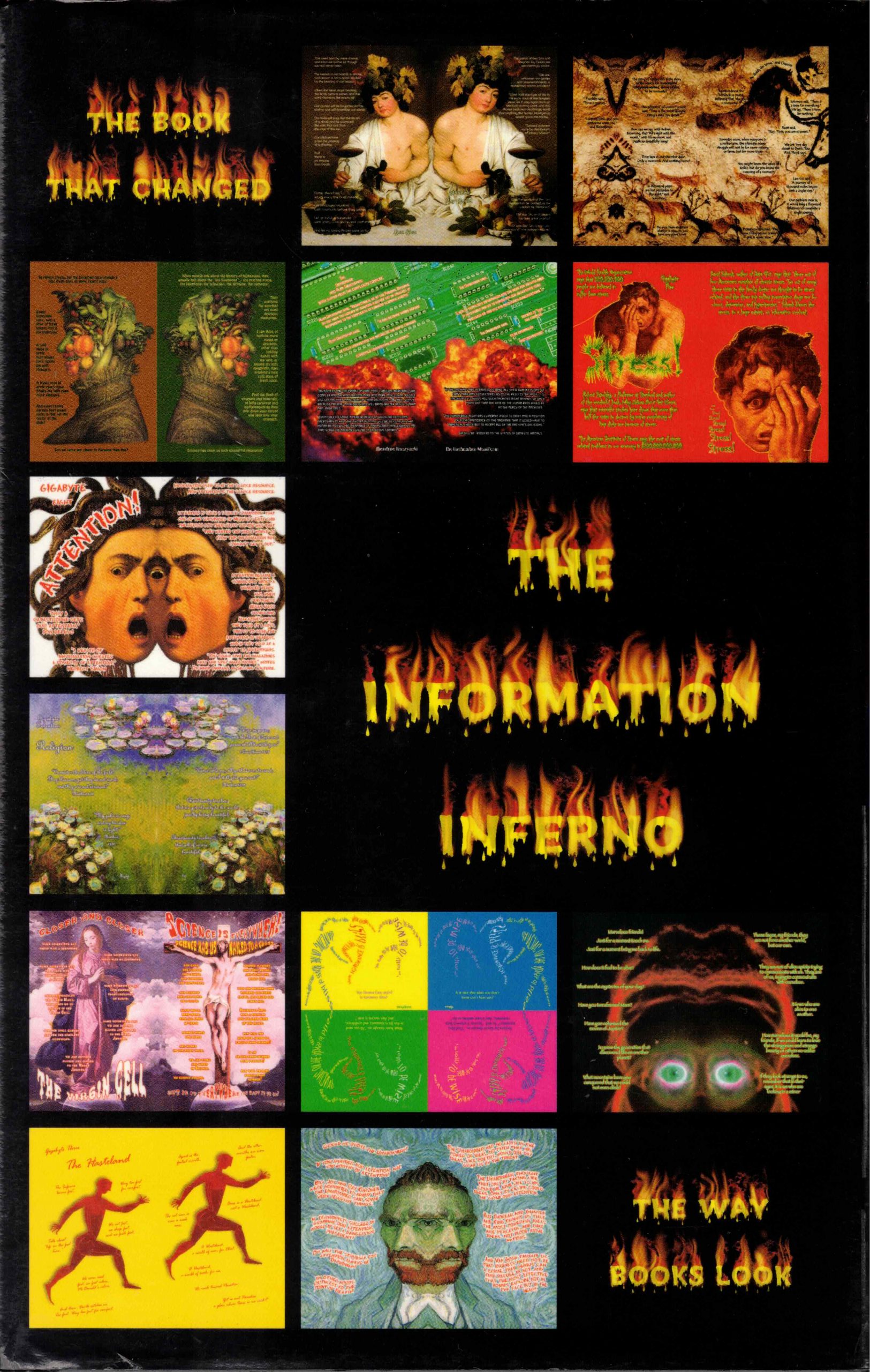
But out of those halcyon days of promise and hope came many ridiculous works of hubris and self-duped professions of faith in the glorious days to come, and among those is this book I’ve just read, The Information Inferno, which promised (in 2001) to be “The Book That Changed The Way Books Look”. Like so many promises of the new millennium, this turned out to be wrong, dead wrong.
It was not supposed to be like this. The Information Inferno from its fiery start—the first chapter uses a new font with flames above each letter—lays out a manifesto for an entirely new New Age, an age of triumph for a new medium blending the best of the old, words and images finally joined as never before through the miracles of computers. Ah, computers! How wonderful they seemed to our ancestors of two decades ago. The incomprehensible sheer power to manipulate text and pictures placed at their fingertips! The connections between thought and science and data that once took generations which would now happen at light speed! As my friend Jim DeVito once said, “People sure were naïve when they were our parents.” Or in this case, us.
Unfortunately, the failure of this book’s program is obvious to any current reader, and should have been obvious to any reader back then. The vaunted font with the flames (you can see it on the cover of the book)—called “Whodinian Fire” and, we are informed, trademarked by “CyberCity Press”—is simply unreadable, and there is much worse to come. The unreadability turns out to be a blessing, because once we manage to comprehend the actual text, we will regret it.
Another hallmark of the Internet Age is shown by the legal fiction of “CyberCity Press”, under whose name the “Design” is copyrighted, with the text itself being copyrighted under the rubric of “CyberCity Publishing”. The copyright page has several notices of trademarks and service marks along with the usual legal boiler plate. We learn there that “The Book That Changed The Way Books Look” is a trademark of the same “CyberCity Press” (though they missed a trick and forgot to grab “The Book That Changes The Way Books Look”), along with a lot of other cute words and phrases. (I might be worried about using this legally protected trademark here if it weren’t for the fact that they (whoever ‘they’ might be) let the trademark lapse back in October of 2002, perhaps the smartest move around this whole publishing venture.) The putative author of this worldchanging opus is one “Whodini”, who (or better, which) also turns out to be a trademark of the legal entity that was created to protect this oh-so-valuable property from the hordes of scammers who, it was feared (by somebody), would rush in to grab all the valuable property and ideas being promulgated by this breathtaking and breathless genius who saw the future of publishing and design long before the rest of us clods. And thus does duality and the infinite expansion of fictive legalities make its appearance in the supposed Garden of Technology Eden, just one of a seemingly infinite number of snakes looking about for actual humans to tempt towards a knowledge of … well, what, exactly?
Well, there we run into some problems, because even if writing has been replaced by ‘content creation’, there are still some poor schmucks (like me, for instance) who have the strange idea that words do matter, that building a fancy high-tech well-designed and beautifully illustrated Website or book with simple repetitions of “lorem ipsum” isn’t quite the same as having something to say. Reading the text of The Information Inferno is not quite the same descent into idiocy that ChatGPT will bring us to, but it ain’t far from it—though we have to assume that this book at least was written at some point by an actual human being. The argument, as far as I can make it out through the dazzle and gee-whilikers whiz-bang of the design, is that long books are stupid, that there’s too much data for the fast-moving folks of the future to bother themselves with, that therefore books should present just small and easily digested bits of text for the reader, and—to top it all off and the great insight of the mythical “Whodini”—text should be combined with images for big impact! Oh, and also the text itself should be in color. Okay.
This short summary doesn’t even begin to capture all that is stupid in both the subject matter and the delivery of this hefty tome. For example, rather than ‘old’ ideas like ‘chapters’ and ‘page numbers’, the author slash designer presents his magnum opus divided into ‘gigabytes’ and ’megabytes’ and ‘soundbytes’. (The only other book published by this nebula of legal entities appears to be one Christ In Color (also called 100 Soundbytes of Christ), where—according to the (now defunct) Webpage breathlessly announcing this new book designed by Whodini—“100 famous soundbytes from the New Testament are set in a rich purple color and placed against a black background.” Ooookay.) Almost all of The Information Inferno consists of text in nearly unreadable fonts laid out (usually poorly) in front of images from old paintings and stock photos—most of which have been simply flipped at the gutter to use the same mirrored image for left and right page. This makes the book read like a gloriously produced (more on that in just a sec) version of the world’s worst PowerPoint presentation.

This use of old out-of-copyright art mirror-flipped at the gutter leads to such monstrosities (many, many times) as this two-page spread from ‘Gigabyte Eight’, featuring a classic image of Van Gogh—though in this case he has no ears, and three eyes, one of which stares out at the reader in horror as if trying to distance himself from the facile and puerile philosophy being presented in his name. Is it true that “Van Gogh taught us that madness need not be a crime, that genius can find refuge in art, and that the most effective bombs explode not in the face but in the heart”? Seriously, read the whole text, and you will know as much as you need to know about the content presented here, which, come to think of it, may not be all that far from ChatGPT quality at that.
The whole book is gloriously produced, as I said before, in that the high-res images are reproduced in striking color on heavy satin finish paper, bound in Skivertext with smyth-sewn signatures, and weighs enough to kill someone with, should the need arise. It seems a shame that such loving care was lavished on such a terrible product, but this was not the only waste of the early Internet Age. I spotted my first typo at page twelve, and gave up counting about the time Whodini gave up using normal page numbers and began labelling pages instead with ‘Megabyte’ numbers. (See the image in the paragraph above for an example.) And don’t get me wrong: proofreading is hard, and even harder in captions and headings and the like—and nearly all the text in this book is of that ilk. But … well, the text is almost unreadable at many places in this tome, which purportedly shows the wonder of the Brave New Book Publishing World, specifically because the ‘designer’ cannot stop using all the features of whatever software he has on his Apple computer. He brags that, believe it or not, he created this whole opus using solely his one computer at home. I, for one, believe it quite easily. And in the closing section of the book, which seems to be a (slightly) more cogent essay grafted on to the series of “soundbytes” that make up the bulk, wherein Whodini™ is making the case that books of the future will have text in color and will have images integrated with the text, will have indeed the text right smack dab on top of the image (Wowzers!) (This, by the way, is the grand revelation of the entire book), there follows a section of supposedly normal text the old way with just black and white text on pages with not pictures at all. The point being, look how bad this looks compared to that fantastic pictures and text combined stuff Whodini™ just showed you. I was struck, however, by the fact that the designer chose a monotype-adjacent typewriter font for this section, that he used ‘dumb quotes’, that he couldn’t even keep his margins or the gutter consistent from the first two pages to the next, and … more oddly … that between each and every sentence there was a period followed by two spaces followed by three periods followed by another space.
That is to say. … Whodini wrote each sentence of this six-page section of the book with very odd punctuation and spacing. … As if the normal operation of paragraphs was unknown to Whodini. … Or maybe it was two spaces around each side of the ellipses. … And sometimes there would not be the ellipses between sentences. I suppose because they were deemed to be connected in some way? … But mostly it was endless text in a standard but nearly as unreadable font as the bizarre ‘art’ fonts used in the rest of the book, with extra space randomly thrown in at the top of the page, or maybe the bottom, or the gutter, or I just don’t even know anymore.
So, what is the final verdict? Well, the verdict of history has been known for some time now. Even WIRED magazine has given up the crazy almost unreadable typography and design that it was so enamored with in the late ‘90s and early ‘noughts. In spite of its great pretensions and overweening self-confidence, The Information Inferno did not manage to ‘change the ways books look’. Instead, this gorgeously produced overweight tome was harbinger of the coming revolution which is still called today by the misnomer ‘Technology’, as if that explained anything of the last quarter decade. The era upon us now like a panther on our soon-to-be lifeless corpse is one where art and literature and illustration and writing have all been replaced by ‘content’—a catch-all for blather and now AI-generated nonsense which no longer has to actually be good as long as it looks good. And design and style have been swapped for flash and shiny whizzbangs of CGI and production values in service of the anti-revolution. So much effort is put into creating cool logos and fictitious business names and killer apps and viral content, that somewhere along the way the world of arts and letters was abandoned, and printing—which originally sped Luther’s Theses across Europe and continued to spread ideas around the entire world—was itself declared dead and why look into a book or magazine or newspaper when it’s all on your phone anyway? Thus it is that Whodini’s magnum dopus looks striking, is printed wonderfully on the heaviest paper you wish that book of Bosch reproductions had used, but the actual words—if and when you finally are able to read them—are banal beyond belief, the philosophy no better than the nonsense you spouted as a freshman in college sitting around a student lounge high as a kite and discussing Kierkegaard and munchies. Do not drop The Information Inferno on your feet, as it will break your toes, but pick up some other book, almost any other book will do. There’s still plenty of good stuff out there, in the books that haven’t changed the way that books look.